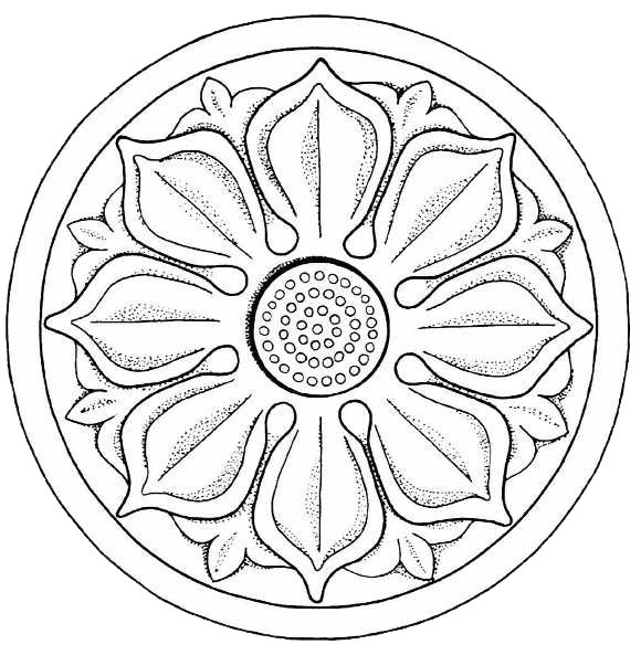
Today I'm going to show you another animation from CSS3 Keyframes. We are going to spin an image. First find a circular image like this.
Now type the HTML Code.
< img id = "spinning_image" src="images/lotus.png" />
Next type the codes given below in your CSS Sheet.
@keyframes spin {
100% {
transform:rotate(360deg);
}
}
spin is the name of your animation. % represents the direction of your animation. transform property and rotate value helps us to rotate our image. In this tutorial, the rotate value is set to 360 degrees. It means a Full or a Complete rotation. Now add this code to your CSS Sheet.
#spinning_image {
animation: spin 50s infinite;
}
Now you have connected above two codes togeather. You have defined the animation name as "spin". 50s means the speed or duration of the animation. The animation will start from 0s and end exactly at 50s.
We can make the animation as a loop from using infinite. If you remove infinate and add numeric 2, then the image will spin only 2 times(The animation will stop after 2 times). If you put 100, then it will spin(animate) 100 times. Not 101.
Take a look at the results...

You can change the duration time if you want. For example take a look at the two images given below. I have set the first image to 5s and second image to 60s.


In above examples, the images are rotating according to clockwise. Because we have set the diraction to 100%. But you can set the direction to anticlockwise too. Set 100% to 0% and see....

Set the direction to 50%, if you want to rotate your image to both clockwise and anticlockwise.

Inspired from Sesath Craft developed by Melan Yapa

Now type the HTML Code.
< img id = "spinning_image" src="images/lotus.png" />
Next type the codes given below in your CSS Sheet.
@keyframes spin {
100% {
transform:rotate(360deg);
}
}
spin is the name of your animation. % represents the direction of your animation. transform property and rotate value helps us to rotate our image. In this tutorial, the rotate value is set to 360 degrees. It means a Full or a Complete rotation. Now add this code to your CSS Sheet.
#spinning_image {
animation: spin 50s infinite;
}
Now you have connected above two codes togeather. You have defined the animation name as "spin". 50s means the speed or duration of the animation. The animation will start from 0s and end exactly at 50s.
We can make the animation as a loop from using infinite. If you remove infinate and add numeric 2, then the image will spin only 2 times(The animation will stop after 2 times). If you put 100, then it will spin(animate) 100 times. Not 101.
Take a look at the results...

You can change the duration time if you want. For example take a look at the two images given below. I have set the first image to 5s and second image to 60s.


In above examples, the images are rotating according to clockwise. Because we have set the diraction to 100%. But you can set the direction to anticlockwise too. Set 100% to 0% and see....

Set the direction to 50%, if you want to rotate your image to both clockwise and anticlockwise.

Inspired from Sesath Craft developed by Melan Yapa
By : Danula Randika Wickramaarachchi
From : Sri Lanka
Published Date : 2017.04.04
Comments
Thanks for reading. Leave a comment to let us know what you think...